Exclusively Koi
E-Commerce website
Exclusively Koi approached us with a clear goal: build an e-commerce experience that converts. Using insights from existing UX research and our experience in product design, we designed a site that puts usability first, and is optimised for speed, clarity and buying journeys. From first click to checkout, every touchpoint was carefully considered to increase conversions, raise average order values, and reduce basket & checkout abandonment.
Whether browsing on desktop or mobile, users are guided through an experience that makes buying simple and intuitive. This is e-commerce design with purpose, backed by data and built to perform.
Product Listing
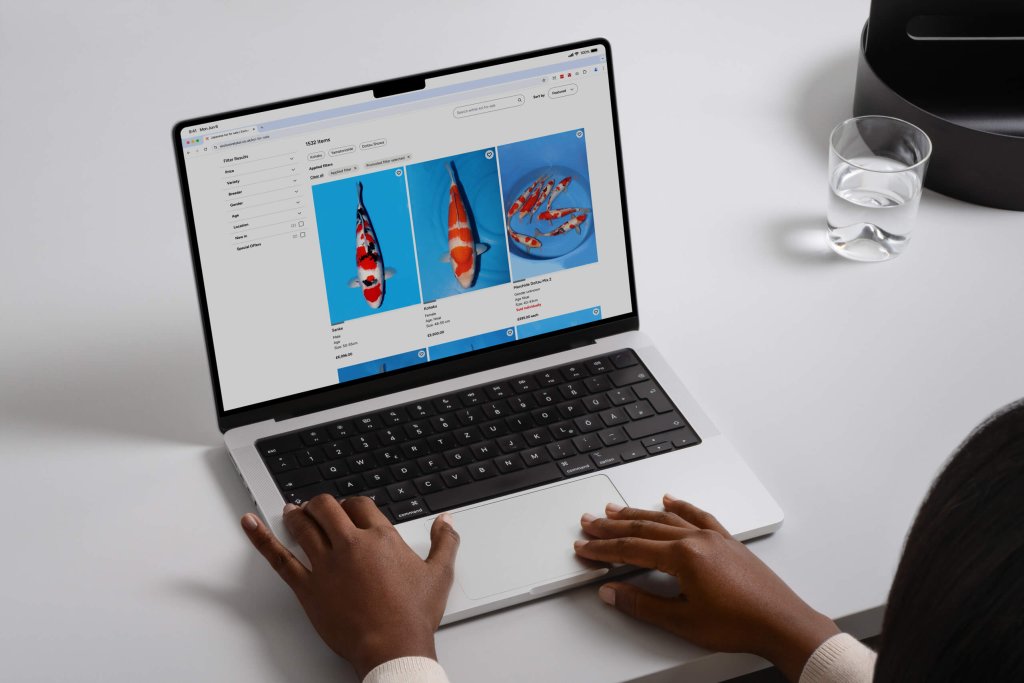
We reimagined the product listing experience to help users find what they need fast. Listing cards now surface key product information, so users can easily compare products without having to move in and out of the product pages. Users are able to save items to their wish list to help reduce basket abandonment. Product variations are indicated on the listing cards and not spread throughout the list.
Filters were strategically ordered with popular options made prominent. Industry jargon was also explained. By keeping the interface clean and focused, users stay engaged, spend longer browsing, and are more likely to convert.
Basket and Checkout
The Basket and checkout were streamlined to minimise drop-offs and reduce friction. Guest checkout is front and centre, with account creation deferred until after purchase. Single-column forms, smart field logic and adaptive error messaging all work together to simplify the process.
We also introduced an order summary and secure payment design that builds trust and ensures users can cross-check their items easily. The result? Faster checkouts, fewer abandoned baskets, and a significant lift in completed transactions.