visual identity
Every visual decision a brand makes shapes how people feel about it before they have read a single word or spoken to anyone. The weight of the typography, the restraint or boldness of the colour palette, the way photography is framed: these are not aesthetic choices. They are signals. They either reinforce the brand's positioning or quietly work against it.
Think of your brand as a person meeting someone for the first time. Before they say a word, an impression has already formed: how they look, how they carry themselves, what they choose to wear. Visual identity is exactly that first impression for a brand. It communicates character, confidence, and credibility before the conversation has started.
This is why visual identity cannot be separated from brand strategy. The visual system is the expression of the strategic thinking underneath it. When those two things are aligned, the brand feels coherent and intentional. When they are not, it looks professional without communicating anything specific, and professional-looking brands with unclear positioning do not convert the right clients with any more consistency than unclear-looking ones.
What a visual identity includes
A visual identity is a system, not a collection of assets. The individual elements have limited meaning on their own. It is the relationship between them, and the consistency with which they are applied, that gives the identity its power.
The logo's job is identification, not communication. A logo that tries to say everything usually says nothing clearly. The strongest marks are simple enough to be recognised without context and distinctive enough to be remembered without effort.
Colour is doing significantly more work. It is processed faster than any other visual element, which means it is shaping how someone feels about a brand before they have had time to consciously evaluate anything. Restrained, deep palettes signal premium and authority. High-contrast, bold palettes signal energy and accessibility. Both are legitimate. Both need to be chosen in relation to the positioning, not in relation to what happens to look good.
Typography communicates personality at a level most people do not consciously notice but consistently respond to. The imagery style extends the identity into every piece of content the brand produces. Graphic elements give the system the flexibility to hold together at any scale, from a business card to a building to a digital campaign.
Visual identity grounded in strategy
The Center Parcs project is a useful illustration of the strategic constraints that make visual identity work interesting. The brief was to design a brand for Restaurant Runner, a new food delivery service, that felt distinct enough to stand on its own but clearly at home within the Center Parcs world. Getting that balance right required the strategy to be settled before any visual decisions were made. The result is an identity that feels considered rather than compromised.
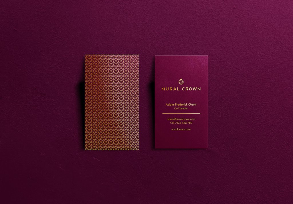
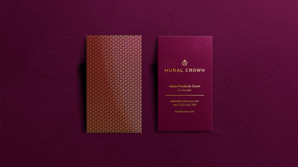
For Mural Crown, a wealth management firm moving into a broader and more competitive market, the challenge was an identity that communicated authority and discretion without reaching for the visual cliches of financial services branding. The logomark built from the initials M and C, the palette of deep purples and measured neutrals, and the typography chosen for calm authority all supported a position of quiet confidence. Nothing was chosen to impress. Everything was chosen to communicate.
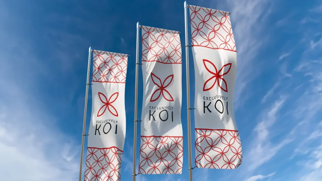
For Exclusively Koi, the identity drew on Japanese art and symbolism to create a mark where four fish form a radial X: a quiet nod to the word 'Exclusively' that works because it is rooted in the business's identity rather than applied as decoration. The result felt earned rather than assembled, which was precisely what an audience of highly knowledgeable specialists needed it to feel.
What brand guidelines are for
A visual identity without brand guidelines is a set of assets, not a system. Guidelines document how the identity works: how the logo is used, how the colour palette applies across different contexts, what the typographic hierarchy looks like, how imagery is selected and framed. They are what allow the brand to be applied consistently by anyone working on it, across any touchpoint, now and in the future.
FAQs
A logo is one element of a visual identity. It handles identification: telling people who they are looking at. The visual identity is the complete system, covering logo, colour palette, typography, imagery style, graphic elements, and the rules for how they work together. A business with only a logo has the most visible part of the system without the system itself.
Every element is decided from the strategy. The positioning, audience, and values established in the brand strategy phase become the brief for the visual work. A brand positioned as premium and restrained needs a different visual language from one positioned as accessible and direct, and those
differences should be legible to the target audience without needing to be explained. If the strategy has not been done, we establish it first.
Yes. Some businesses have a strong strategic foundation and a visual identity that has simply aged or drifted. A refresh updates and modernises the expression of the brand without a full strategic reset, and it can restore coherence and relevance at a fraction of the cost and disruption of starting again. We will tell you honestly which approach your situation warrants.
Yes. Brand guidelines cover the full range of applications: digital, print, environmental, and any specific contexts relevant to the business. The goal is a system robust enough that the brand is immediately recognisable and consistent regardless of where it appears.
Related Content



Related Services
get started
Visual identity design at Saint Associates starts with strategy. If you are building a visual identity from scratch or refreshing one that no longer reflects where the business is, get in touch.
