Quietly confident branding for serious capital
Client
Vitalis Capital
Deliverables
Vitalis Capital invests in sustainability and wellness, not as two separate ideas, but as one combined force for growth, impact, and long-term profitability.
The problem was not the offer. It was the signal.
Vitalis needed to look like what it is. Serious capital, long-term thinking, purpose with discipline. Not generic ESG noise, not venture energy. Just quiet confidence, and a full name that does not get trimmed down for convenience. We kicked off by defining a single organising idea rooted in "vita". Life as growth, resilience, and momentum. Simple. Useful. Hard to misinterpret. It became the filter for everything that followed.
Then we explored multiple concept routes, stress testing each one against the real-world use cases, investor decks, digital touchpoints, and day-to-day documentation. Vitalis selected route 3 for its clarity and authority.

Our Approach
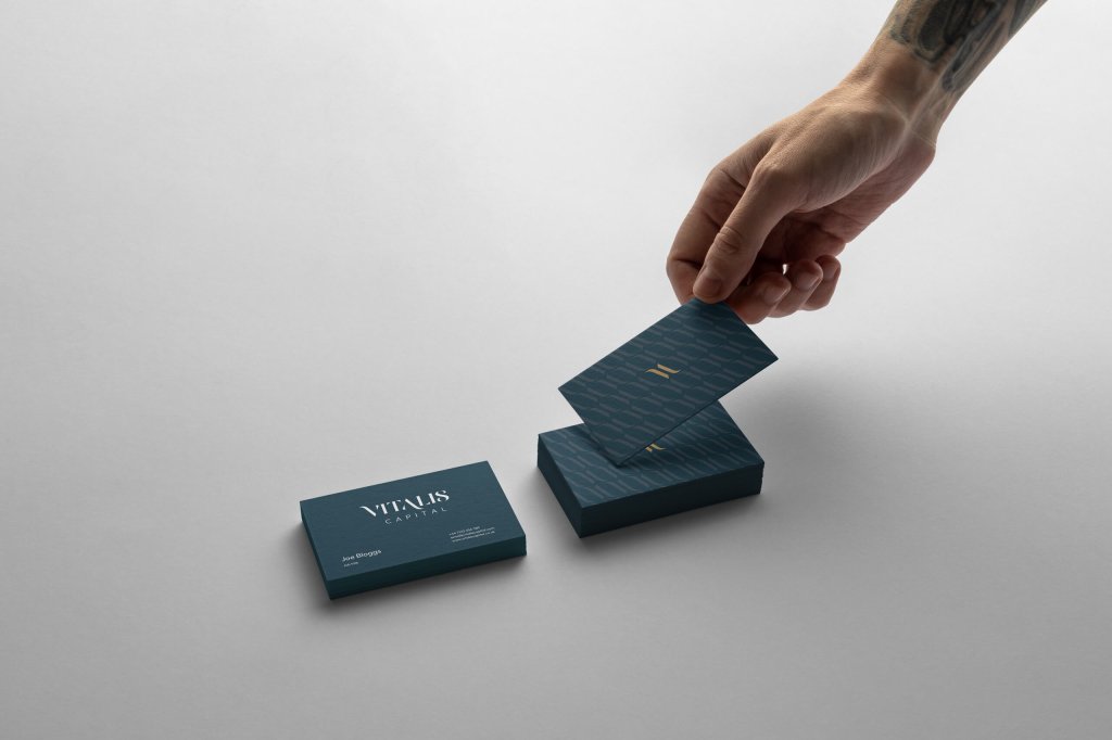
The identity is anchored by a distinctive monogram formed from the upstroke of the V and the downstroke of the A. It brings forward movement without looking eager. It feels premium without feeling precious. That monogram then scales into a repeatable pattern asset, giving Vitalis a recognisable brand texture that works beyond the logo.
A refined serif wordmark adds credibility, while the supporting type keeps the system practical. The palette avoids predictable "eco green" and leans into confidence and longevity, with a warm accent that feels premium, not flashy.
The result is a brand toolkit that looks like a firm you can trust with long-term investment, and a mission you can take seriously.
The Results
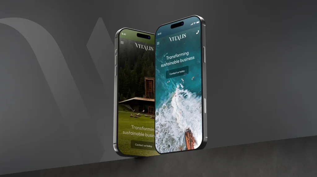
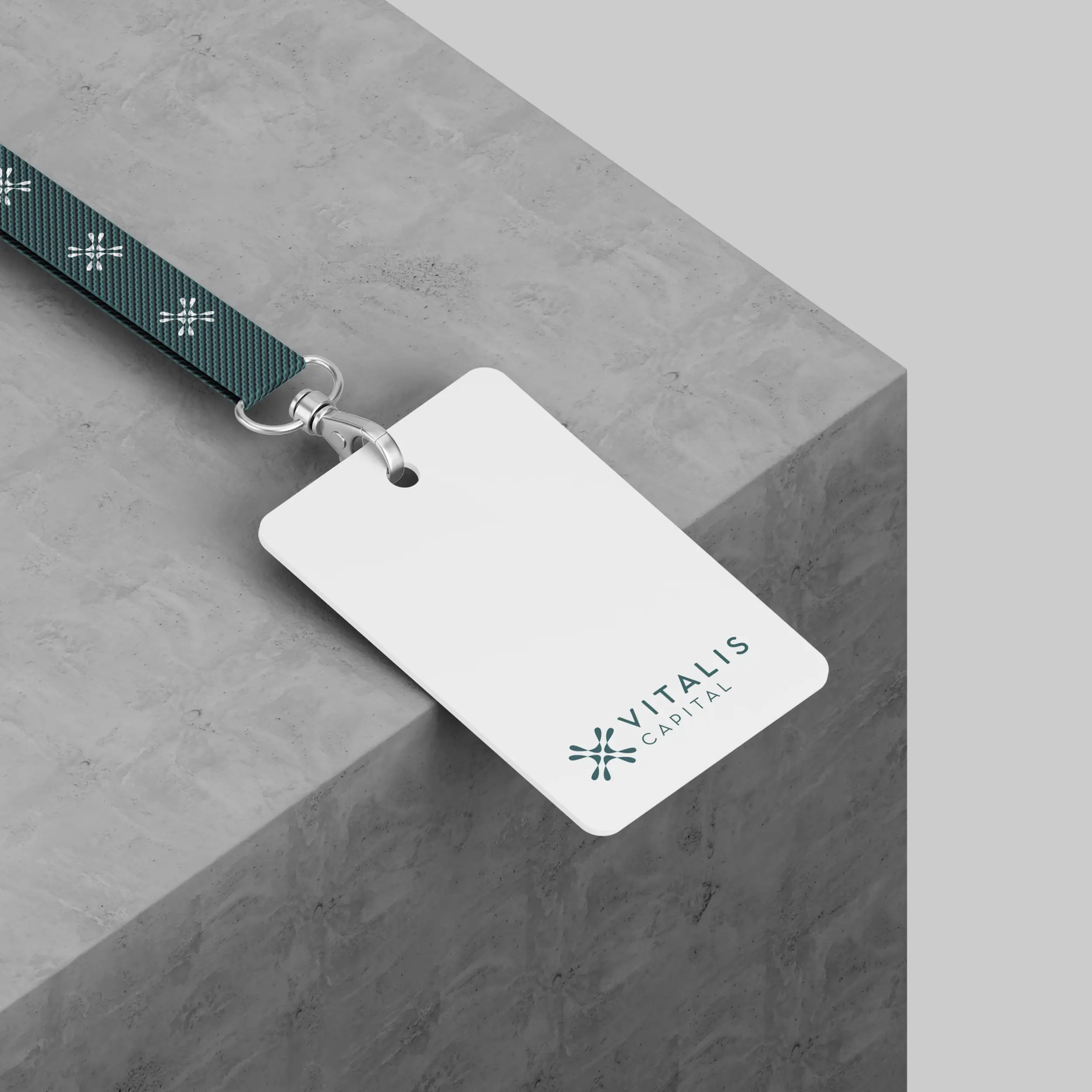
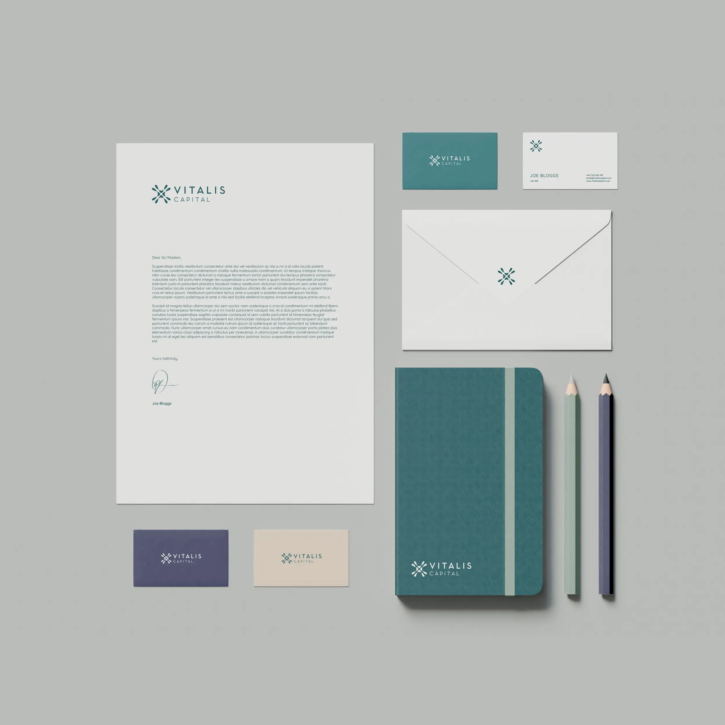
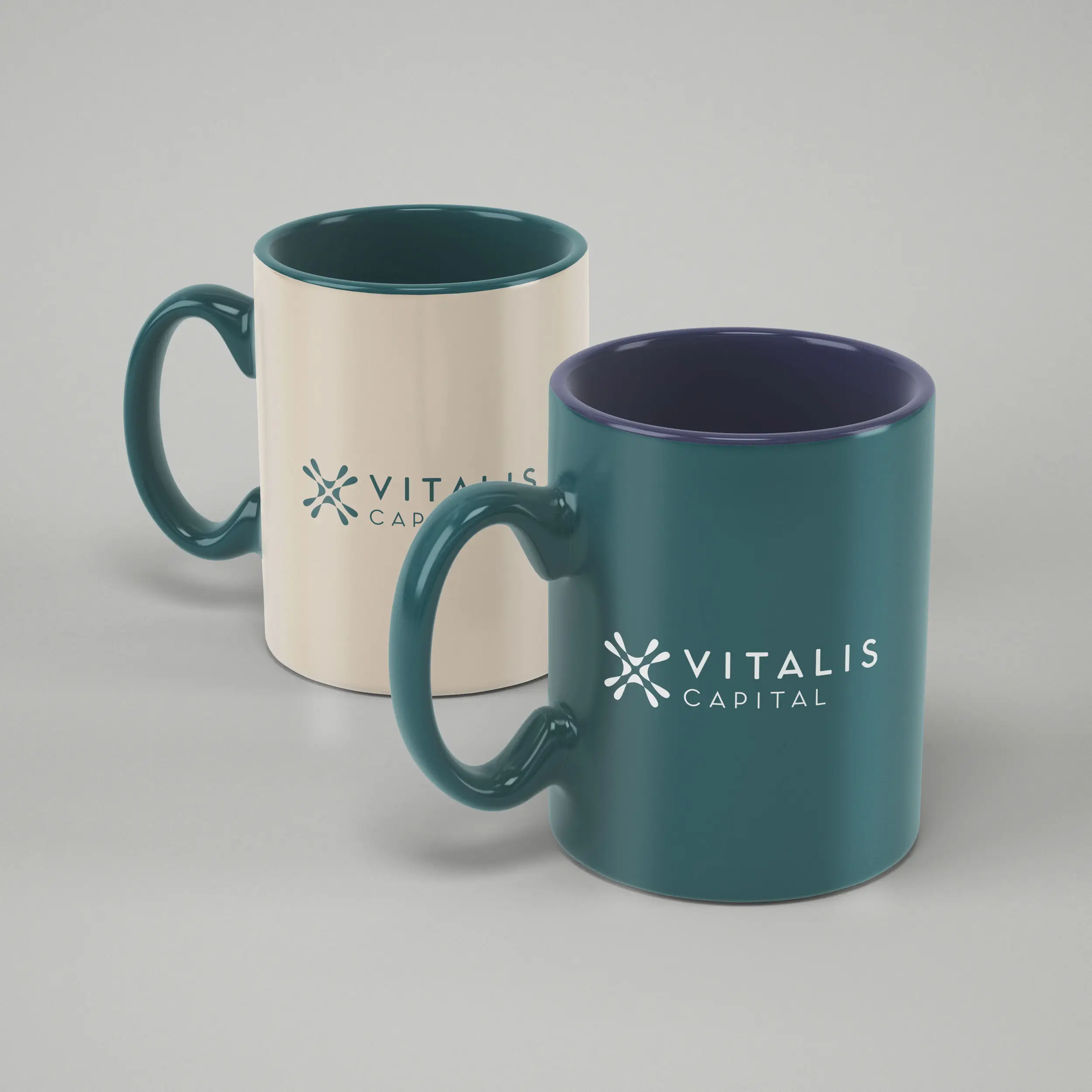
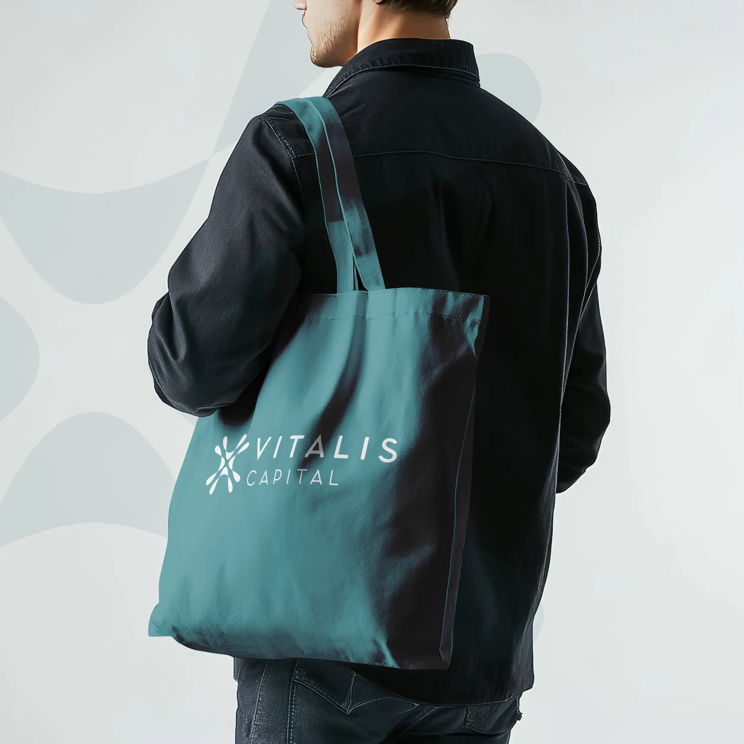
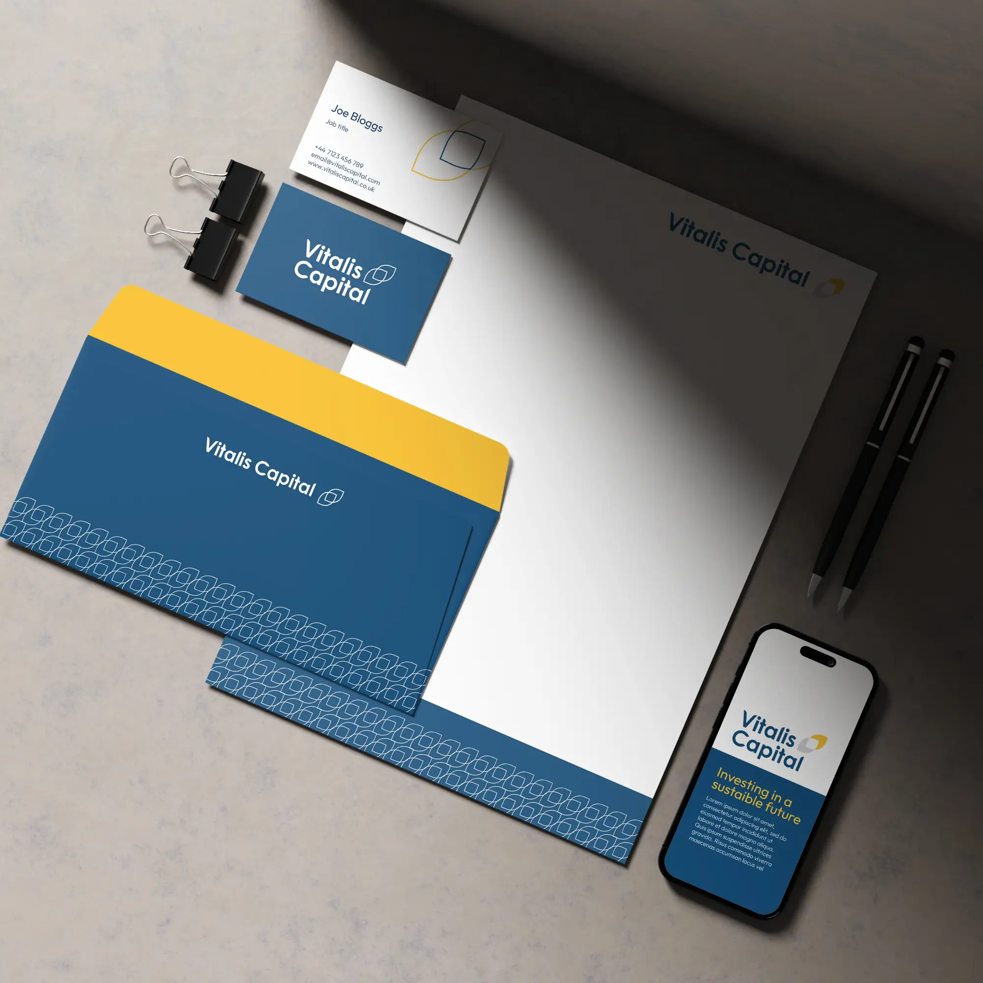
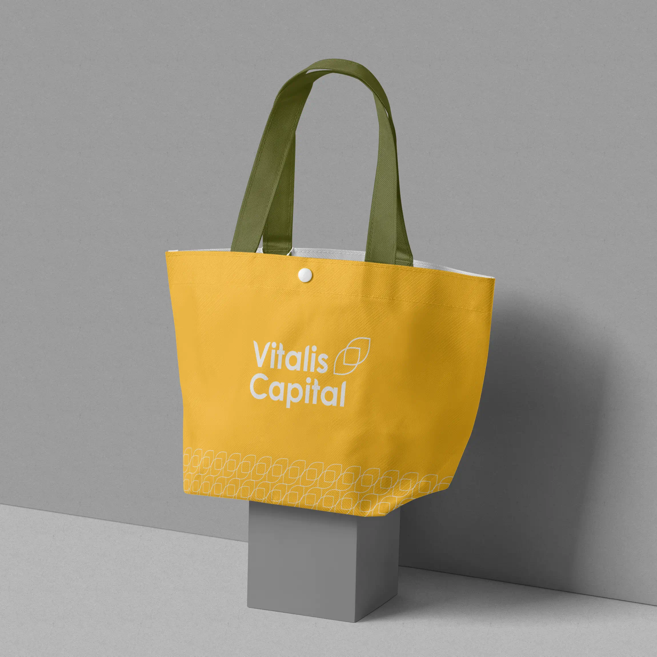
The brand toolkit was built to function from day one. Investor decks, digital platforms, stationery, and branded merchandise all benefit from a system that applies consistently without needing interpretation. Everything was documented clearly, so the Vitalis team can roll it out independently across any surface.
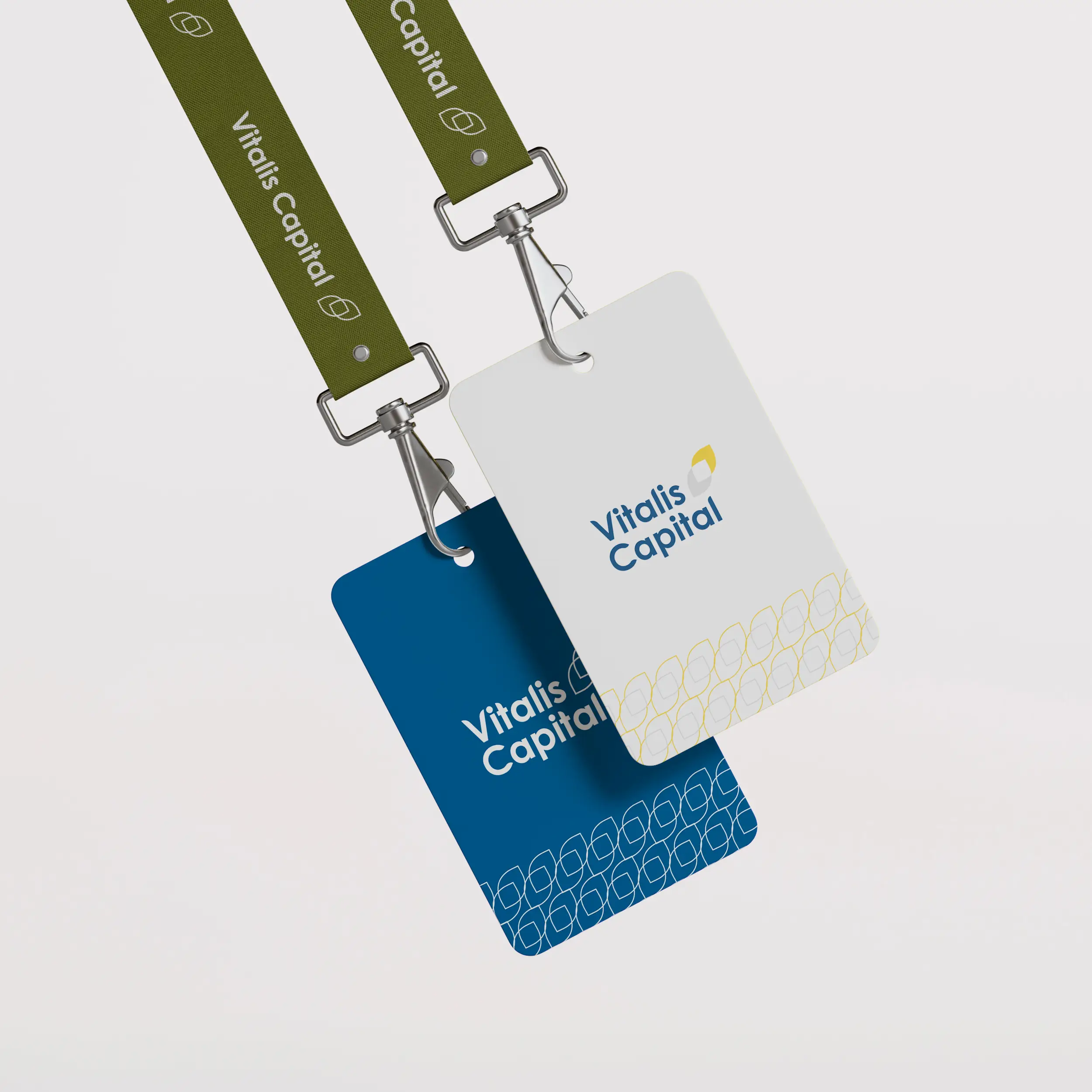
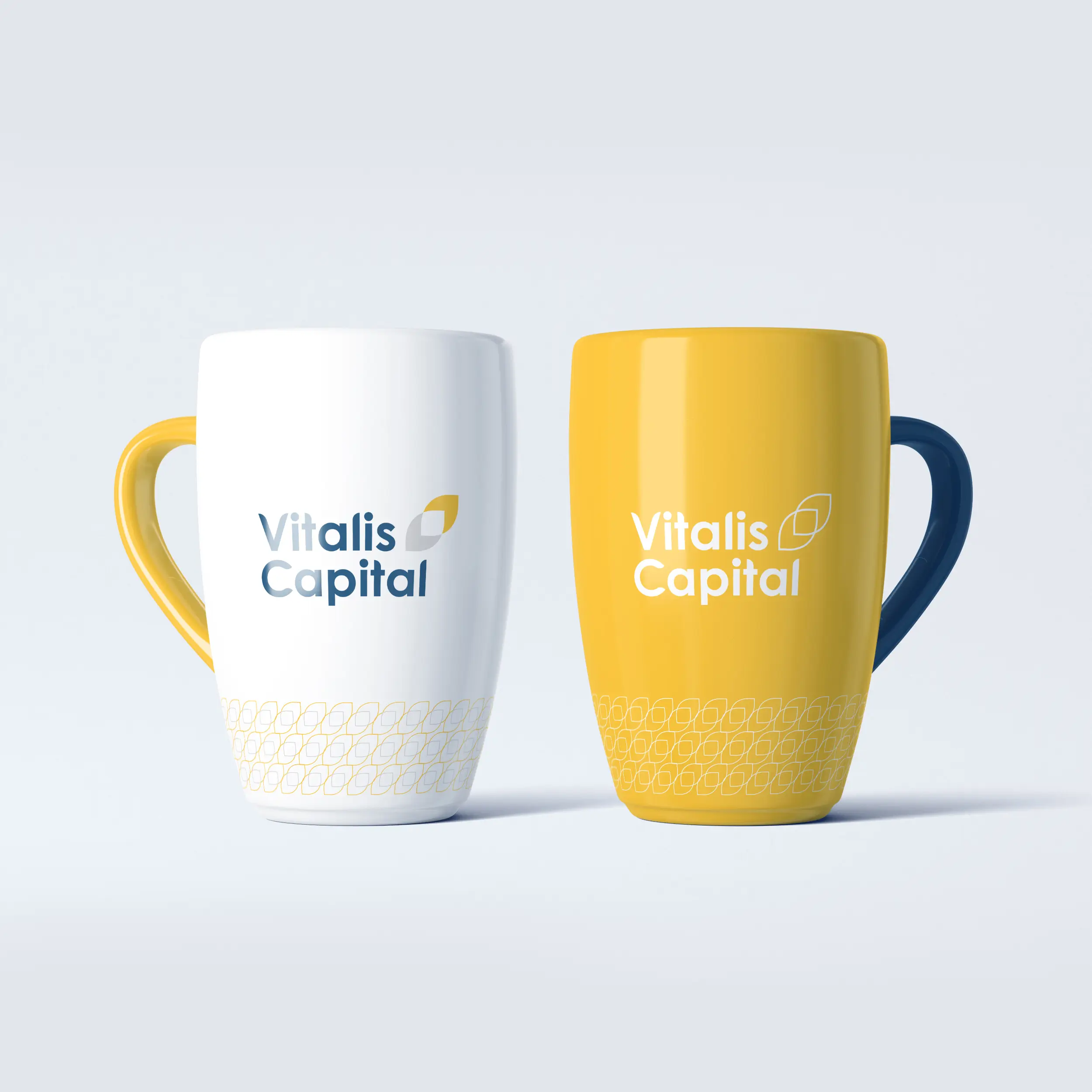
The different concept routes explored during the process are visible in the carousel below. The route Vitalis selected stood apart for one reason: it communicates authority without overstatement. That is a difficult balance to strike, and it is exactly what the brief required.
Let's talk investment & finance branding
At Saint Associates, we help investment and financial services firms build identities that signal credibility, authority, and purpose. If you're looking to position your firm with confidence, let's talk.