The short version
Visual identity is a system, not a logo. Its power comes from the relationship between the parts and the consistency with which they are applied. And the decisions that feel most creative, colour, type, imagery, are actually strategic: they should trace back to your positioning, not to what looks nice in isolation.
What visual identity actually is
Visual identity is a set of decisions, made deliberately and applied consistently, that work together to create a recognisable, coherent impression. The key word is system. A logo, a colour palette, and a typeface have limited meaning on their own; it is the relationship between them, and the consistency of their application, that gives a visual identity its power. A logo sitting alongside the wrong typeface, in a palette that contradicts the positioning, is not a visual identity. It is a collection of parts that happen to coexist.
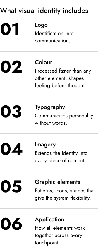
What visual identity includes
| Element | What it does |
|---|---|
| Logo | Identification. It tells people who they are looking at, not what to think |
| Colour | Acts fast on first impressions and carries consistent brand associations |
| Typography | Communicates personality: heritage and authority, or precision, or warmth |
| Imagery | Extends the identity into a consistent visual world across every piece of content |
| Graphic elements | Patterns, textures, icons and shapes that give the system flexibility and scale |
Colour is doing more work than most businesses realise. People form much of a first impression within roughly 90 seconds of contact, and colour weighs heavily in that snap judgement; research also shows colour carries consistent brand-personality associations, with red reading as exciting and blue as competent and trustworthy (Labrecque and Milne, 2012). Deep, restrained hues tend to signal premium and authority; bright, high-contrast palettes signal energy and accessibility; earthy, muted tones signal authenticity and craft. None of these associations are absolute, but they are consistent enough to be chosen deliberately, for the audience and the positioning.
Typography communicates personality most people never consciously notice but consistently respond to. Serif faces tend to read as stable, established, and authoritative, a tendency with some empirical support (Shaikh et al., 2006); designers generally treat geometric sans-serifs as precise and modern, and humanist sans-serifs as warmer and more approachable. These are conventions rather than laws, but the choice still makes a statement about what kind of brand this is, not a stylistic preference.
Why visual identity is a strategic decision, not a creative one
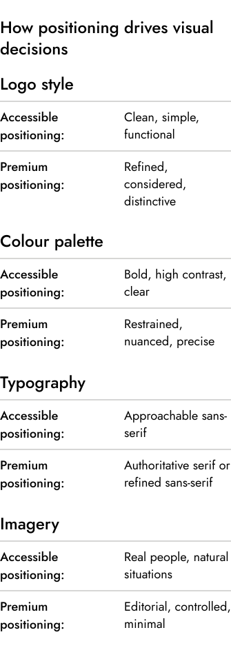
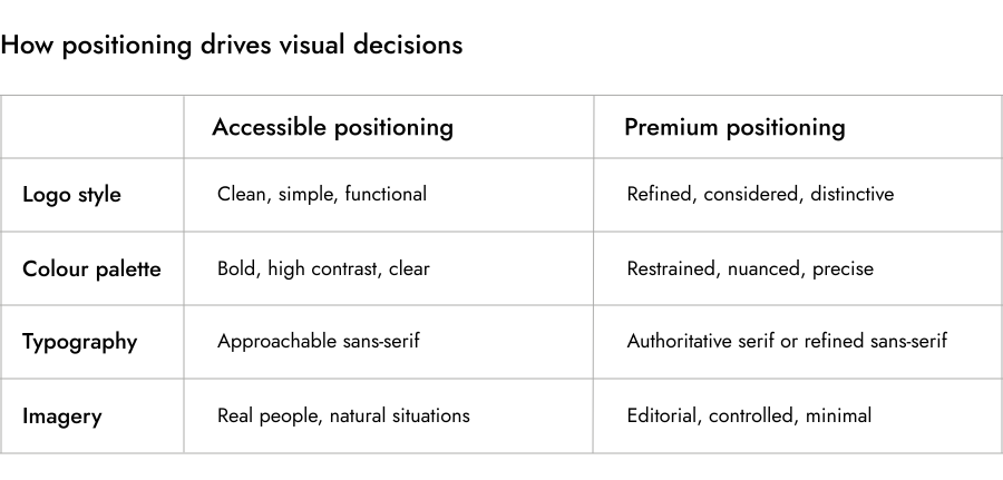
This is where most businesses misunderstand the work. Visual identity decisions feel creative and look creative, but the ones that do their job are driven by strategy. A business positioned as the accessible, straightforward option needs clean lines, high contrast, readable type, and real photography. Give it an elaborate logo, a palette borrowed from luxury branding, and moody editorial imagery, and the identity contradicts the positioning. A specialist, high-end brand needs the reverse: expertise, precision, and restraint. Busy, playful design will undermine the trust it is trying to build.
The Virtu project shows this working. A luxury resort and lifestyle brand that needed an identity capable of carrying serious premium positioning: the palette drawn from nature rather than convention, the typography chosen for refinement and longevity, every decision tracing back to what the brand needed to communicate rather than what looked interesting in isolation.
What coherence looks like in practice
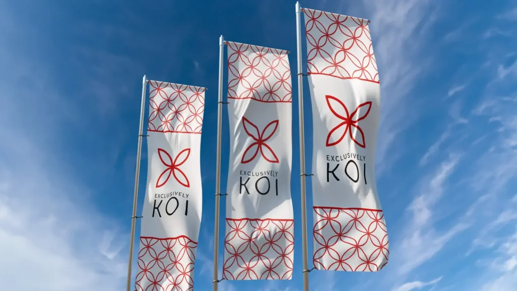
Exclusively Koi shows a different aspect. A UK importer of premium Japanese Koi carp, where the identity had to feel genuinely premium to an audience of experts who would see through anything manufactured. Drawing on Japanese art and sashiko embroidery, the mark reads as earned rather than applied, which is exactly what the audience needed.
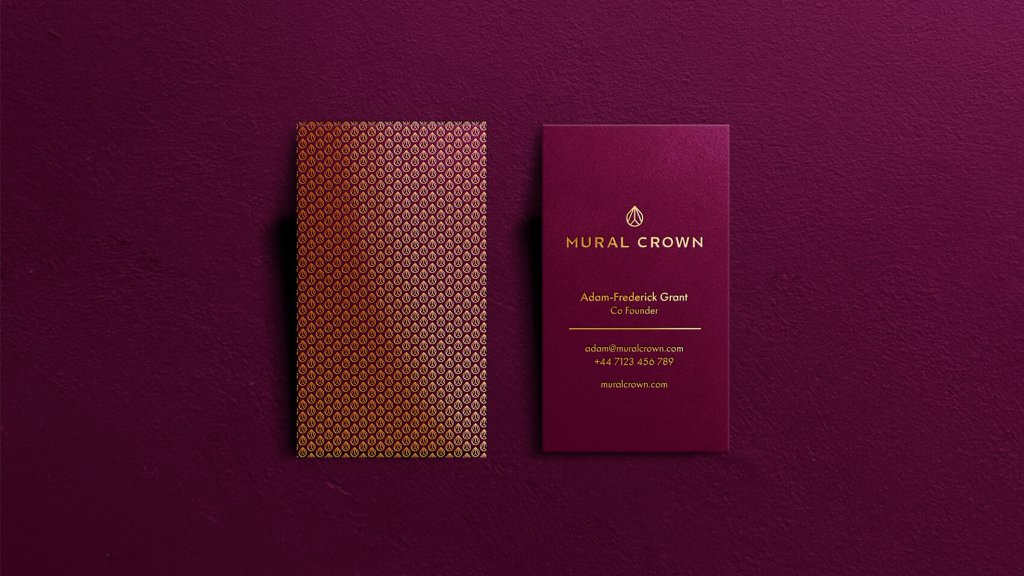
Mural Crown handles another brief again: a wealth-management firm that needed authority and discretion without the visual clichés of financial services. A monogram built from the M and C, a palette of deep purples, blues and metallic accents, and typography chosen for calm authority, all supporting quiet confidence rather than obvious prestige. In each case the decisions were made from the outside in: starting with how the audience needed to feel, and working back to the choices that would produce that feeling.
Visual identity and the wider brand
Visual identity is one part of brand identity, not the whole of it. It works alongside tone of voice and the behaviour of the business in every interaction. When all of those point the same way, the brand becomes recognisable and trusted in a way no single element manages alone. The common failure is treating visual identity as the primary task and everything else as secondary: invest heavily in the look while letting the communications, the tone, and the client experience drift, and the visual investment will not deliver the return it should. Visual identity is the most visible part of a brand, but visibility without coherence is just noise.
Sources
Labrecque and Milne (2012), "Exciting red and competent blue", Journal of the Academy of Marketing Science: colour shapes brand personality.
Shaikh, Chaparro and Fox (2006), "Perception of Fonts", on typeface personality: the study.
Visual identity in practice: Virtu, Exclusively Koi and Mural Crown, Saint Associates.