The short version
Brand identity is a system, not an asset, and it works on three layers: the visual (logo, colour, type, imagery), the verbal (tone of voice, messaging, naming), and the behavioural (how the business actually acts). People buy in because of how it looks; they stay because of how it makes them feel. And identity built without strategy underneath tends to look like a brand without functioning as one.
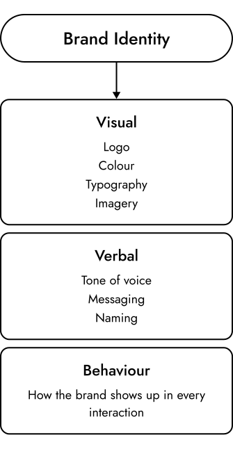
The three layers of a brand identity
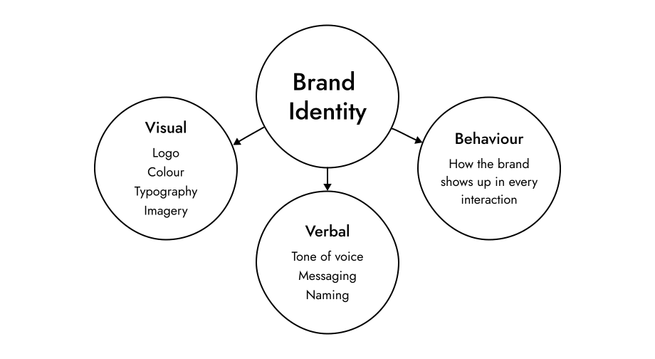
Brand identity is not a single asset. It is a system, and each element should reinforce the others.
| Layer | What it covers |
|---|---|
| Visual | Logo, colour, typography, and imagery style |
| Verbal | Tone of voice, messaging, and naming |
| Behavioural | How the business actually acts: response speed, the quality of a proposal, the tone of an onboarding email |
The visual layer
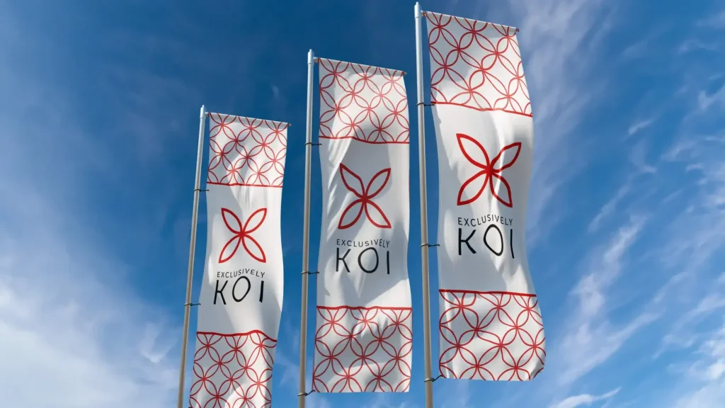
What most people picture, and it matters enormously, but it is one layer. A logo's job is to identify, not to communicate everything a brand stands for; a logo that tries to say too much usually says nothing clearly. For Exclusively Koi, a UK importer of premium Japanese Koi carp, the mark uses a radial pattern of four fish to form an X, a quiet nod to "Exclusively" that works because it is rooted in the business rather than applied as decoration.
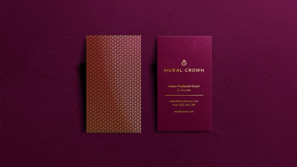
Colour is processed quickly and shapes perception before the surrounding words are consciously read: for Mural Crown, deep purples, rich blues, and metallic accents were chosen to suggest professionalism, control, and legacy, not simply to look appealing. Research bears this out, colour reliably carries brand associations, with red reading as exciting and blue as competent and trustworthy (Labrecque and Milne, 2012).
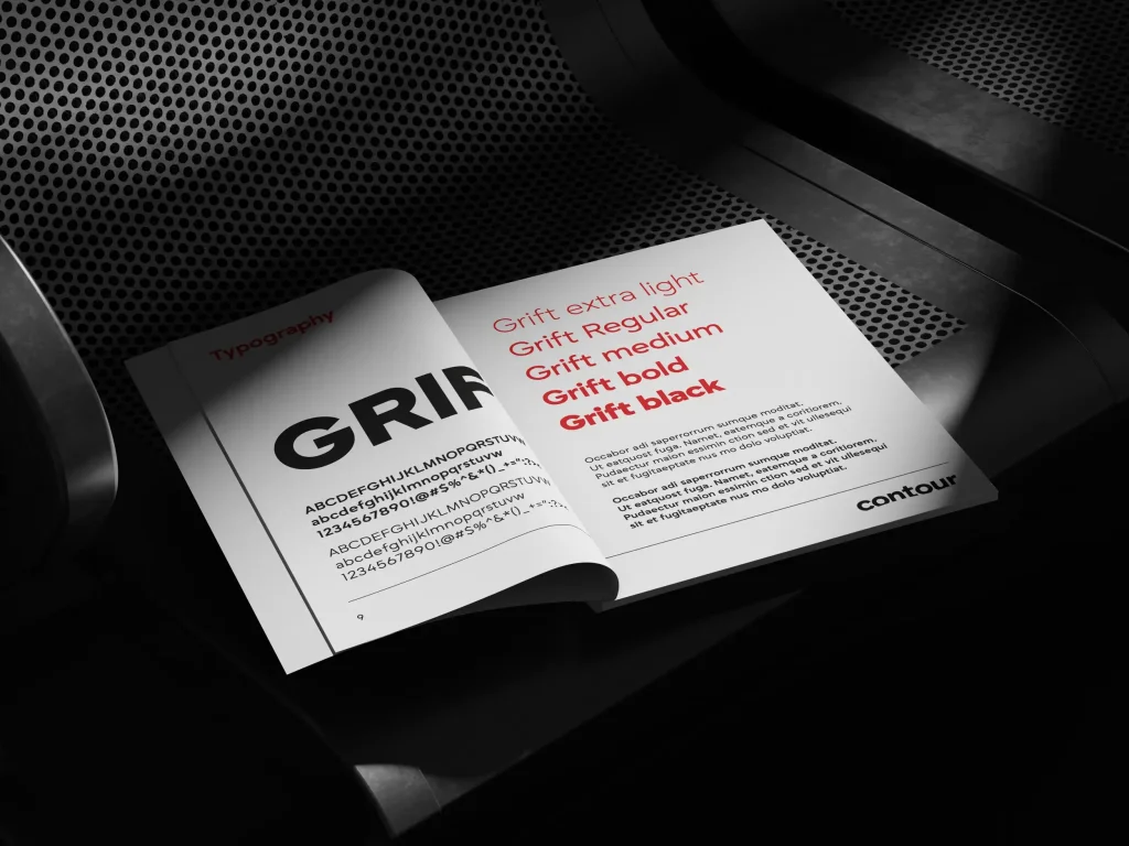
Typography communicates personality, and imagery style, where consistency usually breaks first, extends the identity into every touchpoint.
The verbal layer
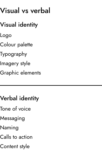
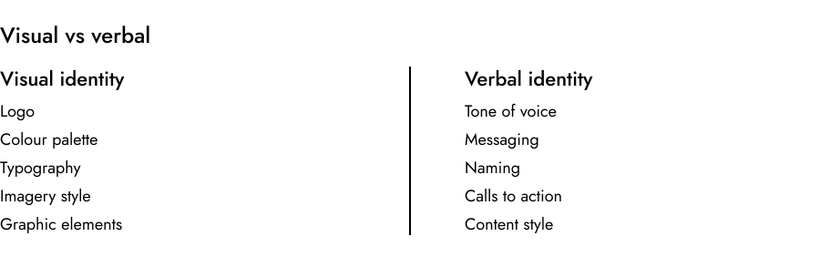
Where many businesses leave value on the table. Tone of voice is the brand's personality in language, shaping how it writes copy, answers enquiries, and handles complaints. Messaging covers what the brand consistently says about itself: its positioning, point of difference, and value. And naming covers not just the business name but the language it uses for services, calls to action, and the people it serves.
The behavioural layer
The part that separates good identity from great, and the hardest to control. It covers everything a customer notices when they actually deal with a business: the quality of a proposal, how quickly the team responds, the language on an invoice, the tone of an onboarding email. None of these are usually thought of as brand assets, but all of them shape the impression the business leaves. People buy into a brand because of how it looks; they stay because of how it makes them feel. A well-designed identity that communicates inconsistently or delivers something that does not match its promise will not return the investment it should.
What strong brand identity looks like
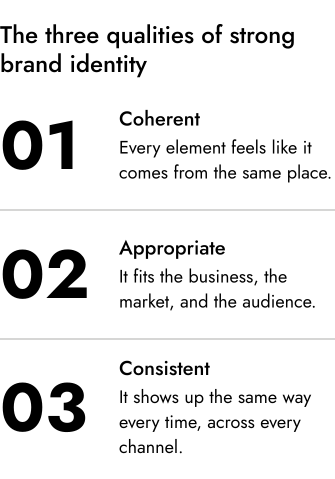
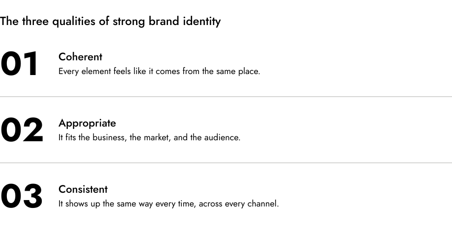
Strong identity shares three qualities, whatever the sector or scale.
It is coherent. Every element, visual, verbal, and behavioural, feels like it comes from the same place. For Virtu, a luxury resort and lifestyle brand, the identity was built around a single idea (the Western Red Cedar), and the logo, patterns, typography, and tone all trace back to it, so every element feels deliberate rather than assembled.
It is appropriate. The identity fits the business, market, and audience. A professional-services firm that looks like a creative agency may turn away the very clients it wants. When Mural Crown came to us needing something refined, intelligent, and quietly confident, the answer was a mark built from the M and C, typography chosen for calm authority, and a palette that suggested control rather than flash.
It is consistent. Identity that appears and disappears depending on the channel or the team member is not functioning as a system. Consistency over time is what makes a business immediately recognisable and trusted.
Brand identity and brand strategy
Brand identity is the expression of brand strategy. Strategy answers who you are for, what you stand for, and why anyone should choose you; identity translates those answers into something people can see, hear, and feel. Built without strategy underneath, the result is usually aesthetically credible but commercially weak: it looks like a brand without functioning as one. With Exclusively Koi the identity work began with discovery workshops that surfaced three core values, authenticity, professionalism, and knowledge, and every design decision served them. That is why the sequence matters: strategy first, identity second, in conversation at every stage.
A proper identity project runs through three phases: discovery, where the strategic foundations are set; design, where the visual and verbal elements are developed with rigour rather than by producing as many options as possible; and delivery, where the identity is documented in brand guidelines that make it possible to apply consistently. Guidelines are not a nice-to-have; they are what separates a brand identity from a logo and some colours.
Sources
Labrecque and Milne (2012), Journal of the Academy of Marketing Science: colour and brand personality.
Harvard Business School Online, on brand identity (its visual, verbal and behavioural elements).
Brand identity in practice: Exclusively Koi, Mural Crown and Virtu, Saint Associates.